


Red is the most evocative color in art history. The pigment is one of the three primary colors, but it outshines the serene, quiet blue and vibrant, cheery yellow. Red is aggressive; it pulls one’s eye toward wherever its hue has been skillfully laid by the artist. Red is intensity, it’s passion, it’s love, it’s lust, it’s war, it’s divinity, it’s blood, and it’s hate.
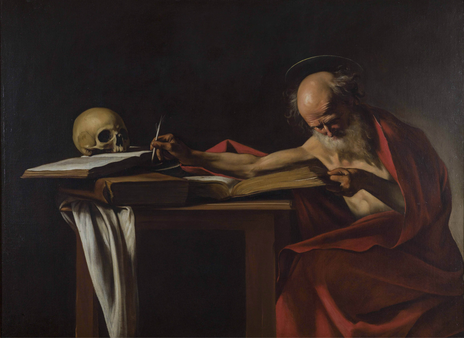
There are innumerable examples of artists who have manipulated this pigment to tell an unspoken story to their audience, instilling the average museum-goer with a rush of intense emotion. In Caravaggio’s “Saint Jerome Writing,” the saint’s bright red robe contrasts with the dull, black background and harsh, Baroque-style lighting. The color emphasizes the figure’s passion, devotion, sacrifice, and crucial spiritual importance, the weight of which is further underscored by his hunched, almost pained position.
The power of red cannot be understated, and an artist who tamed the wild tone (or vice-versa) was the post-impressionist and widely proclaimed “master of color,” Henri Matisse. The man evoked emotions ranging from soothing serenity to energetic chaos, never shying away from the striking hue.
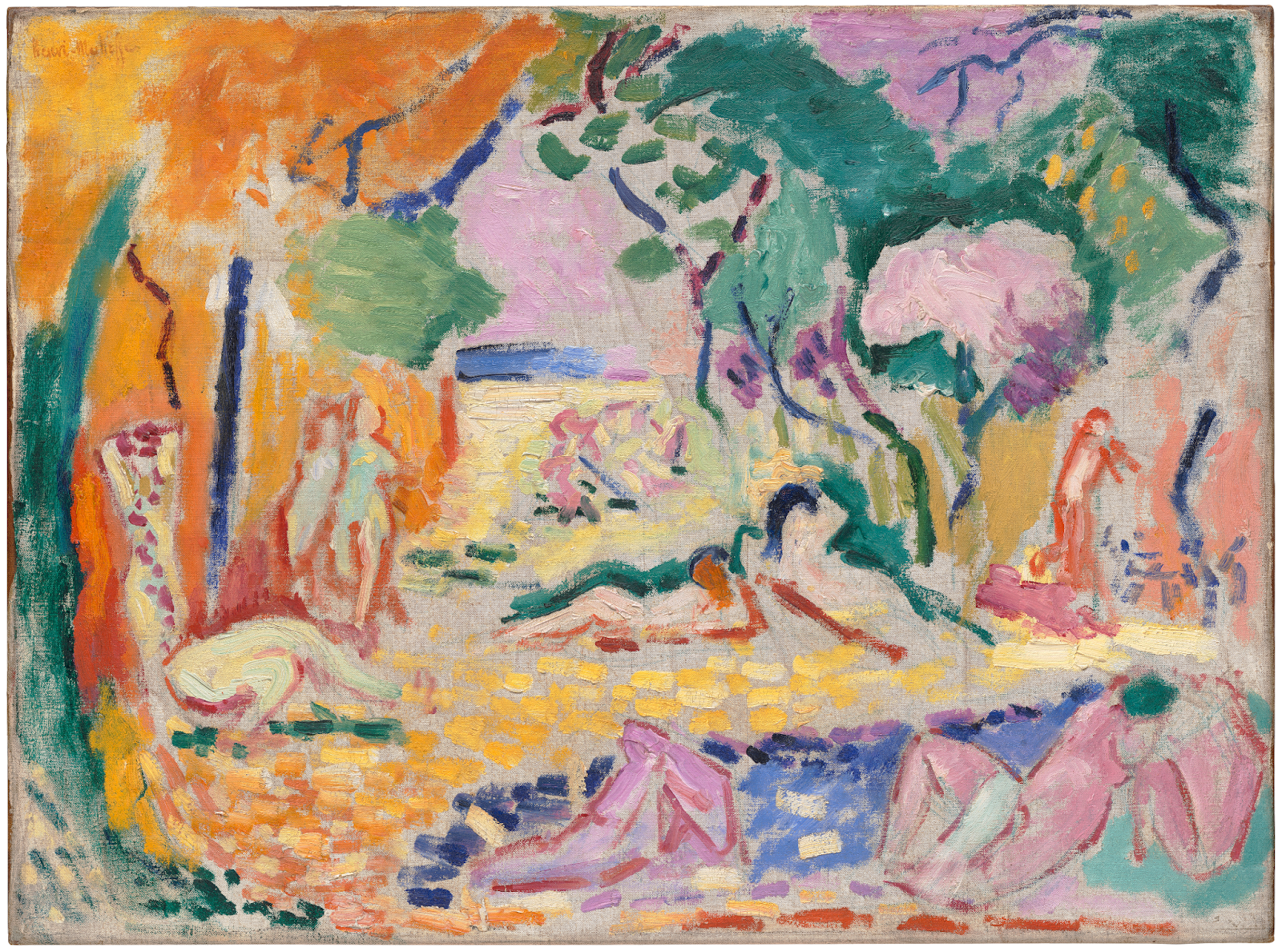
On the more peaceful end of the spectrum is Matisse’s “Le Bonheur de Vivre” or “Joy of Life” (1905-06), a mash-up of vibrant colors meant to represent a joy-filled, pastoral landscape. This painting exemplifies Matisse’s mastery of color, as one cannot confidently identify the primary shade of the piece: it contains striking greens, oranges, blues, purples, yellows, pinks, and the slightest tinge of red.
The thin strokes of red outline the oddly shaped figures strewn throughout the dreamlike landscape. The choice to outline the figures in red rather than sticking to the less intense surrounding palette may have been to evoke a feeling of liveliness, motion, or division between the figures and the natural landscape. However, red was minimized in this piece to keep the mood tranquil and idyllic, evoking feelings of pleasure and contentment.
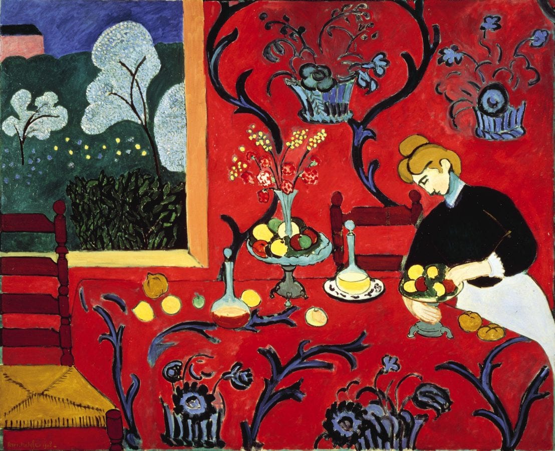
But what happens when red consumes the entire painting? This is the case in Matisse’s “The Dessert: Harmony in Red,” an overwhelming composition whose red is interrupted only by a female figure, a window, and blue accents. The painting was commissioned initially with the intention that the primary color be blue. Still, Matisse was dissatisfied with this rendition and repainted it in his preferred color of a radiant, raspberry-like red:
“Where I got the color red—to be sure, I just don’t know,” Matisse is quoted as saying. “I find that all these things... only become what they are to me when I see them together with the color red.”
The overwhelming use of the same fiery scarlet color reduces the painting’s dimensionality; the red fabric melts into the red walls, which are hardly distinguishable from the slightly darker red chairs. This lack of dimension may be because the piece was mounted as decoration for a dining room. The flatness of the red hues evokes a sense of comfort and warmth rather than chaos or tension due to the consistent decorative elements breaking up the excited hue. These feelings may also stem from the red being on the cooler side, meshing with the blue detailing and greenery seen through the window.
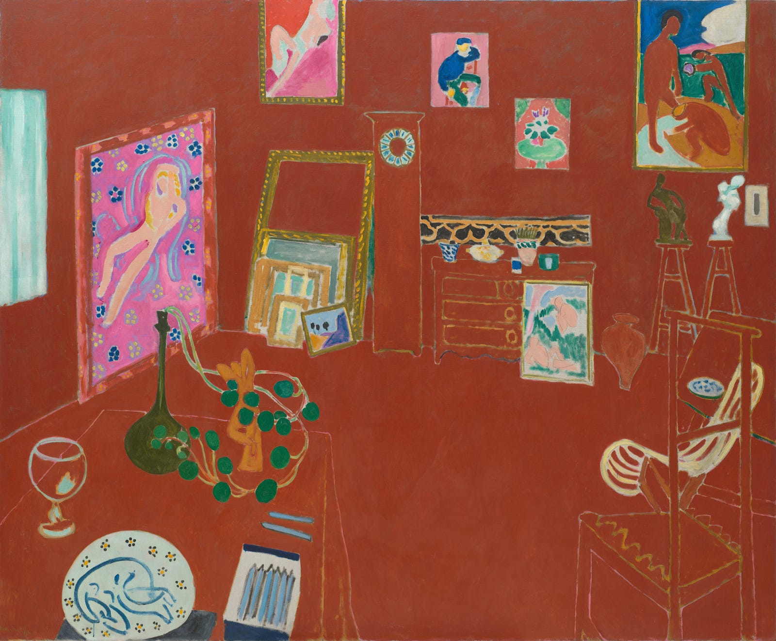
Looking at the last piece, at least one can say that the red table, chairs, floor, and wall are somewhat distinguishable. Matisse’s “L’Atelier Rouge” or “The Red Studio” brings the artist’s unrestrained use of red to its extreme. Similarly, the hues of this painting make the room feel flat, lacking the perspective evident in a traditional interior portrait.
However, this red is much more chaotic and aggressive. It is a bright, extremely warm shade that indiscriminately covers the entire six-by-seven-foot canvas. Further, the hue is entirely flat, with no shadow and extremely minimal linework, leaving no distinction among the wall, dresser, table, chair, and clock. These items are timidly bordered with negative gaps that often find themselves bleeding into the fierce background. The whole composition changes the viewer’s concept of space, clearly placing them at a particular perspective but refusing to allow them to feel a part of the room.
This painting represents Matisse’s workspace. The confrontational color screams at its audience to look at it, while the cooler hues of the items of importance in the space draw attention to their inclusion: pieces of artwork, a plate, art supplies, a plant, sculptures, a glass, and a small window. Notably, the grandfather clock is absent of hands, symbolizing a sense of time suspended as Matisse works in his oasis. This red background imbues his artistic space with an energy no other color could accomplish.
Matisse seems to have felt a deep, personal connection to this excited shade. He used the force of this color to resist traditional definitions of depth and reaffirm his position as a master of post-impressionism, a movement defined by bold colors, deep symbolic meaning, and personal significance to the painter. Matisse used red to an evocative extent, likely learning how to best harness the hue from his mentor Gustave Moreau, who saw color as a spiritual language:
“Colors must be thought, dreamed, imagined.”
Edited by Natalli Newman
 |
|